
- The Basics of Color Theory
- The Color Schemes
- Warm and Cool Colors
- Color Psychology in Fashion
- Color Theory as a Minimalist
- Tips to coordinate the colors of your outfit: The three-colors combo
We could see on social media various trends regarding color theory often involving popular combinations, color palettes, color challenges and so on. We could also see a diverse range of aesthetic preferences, cultural influences and creative expressions that inspire us to experiment with color.
But do we know what color theory exactly is? How could it impact the aesthetics of our outfit and therefore our creative expression?
Color theory is the study of how colors interact and combine to create visually pleasing compositions. In the fashion industry, it’s a crucial tool for designers and stylists to craft outfit that harmonize, balance and contrast effectively.
By understanding color theory, fashion enthusiasts can make intentional choices about color combinations to express individual style and evoke specific emotions. From creating dynamic contrast with complementary colors to achieving harmony with analogous schemes, color theory guides the aesthetic and practical aspects of fashion design and marketing. I would say that it’s the foundation for crafting stylish and cohesive outfits that make a statement.
For fashion lovers, understanding color theory empowers you to create visually appealing and cohesive outfits by selecting colors that complement each other harmoniously and also express your personal style through cohesive and visually appealing outfit.
Let’s explore colors together!
The Basics of Color Theory
We should learn the basics of color theory in order to apply it into fashion and for that, defining the color wheel and its primary, secondary and tertiary colors it’s fundamental.
The Color Wheel
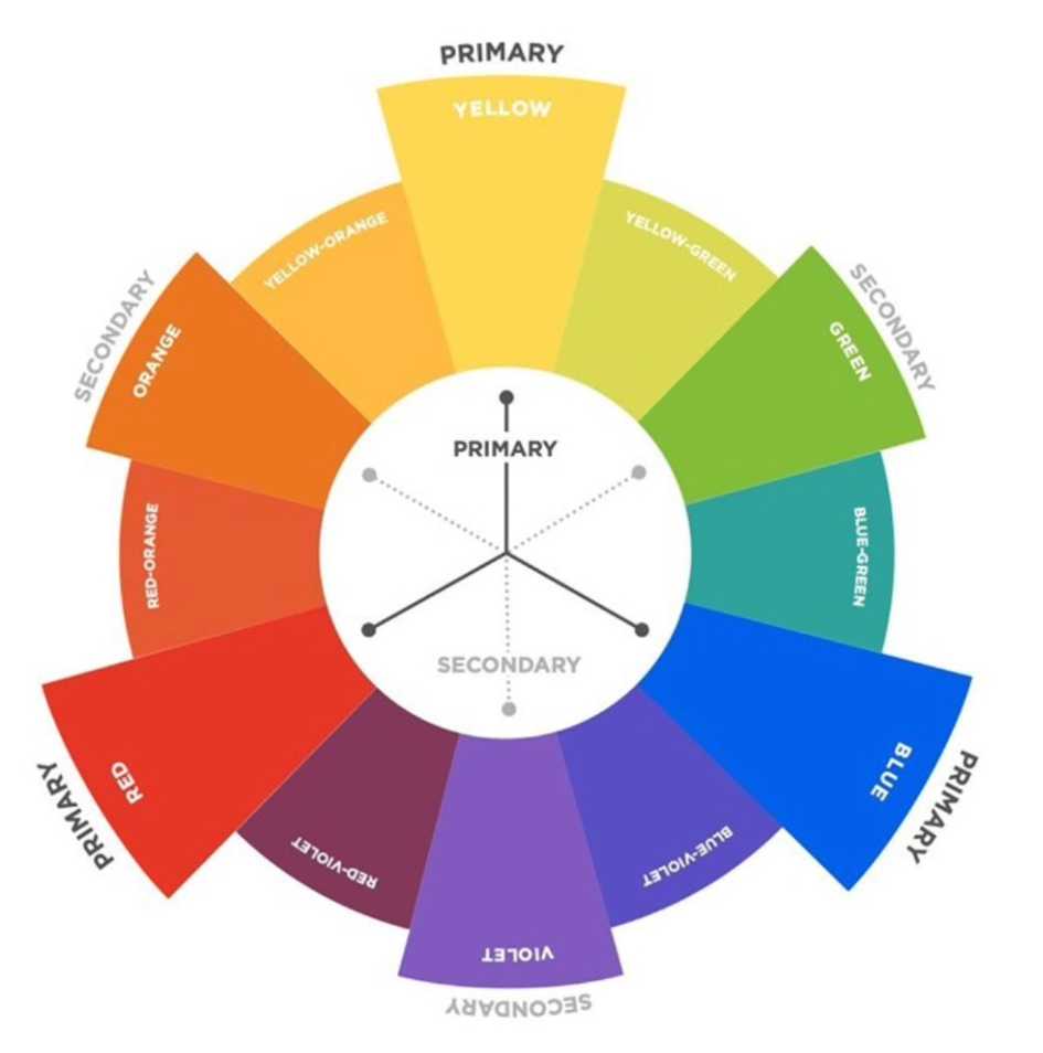
The color wheel is a diagram that organizes colors based on their relationship with each other. This tool is used in color theory to understand the combinations between the colors. It’s divided in 3 sections: Primary, Secondary and Tertiary Colors.
- Primary Colors: They are the foundation of the color wheel and are essential because they can be mixed together to create all other colors on the color wheel.
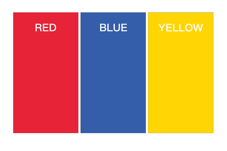
- Red: often associated with passion, energy and warmth;
- Blue: represents calmness, serenity and optimism;
- Yellow: symbolizes joy, happiness and optimism.
2. Secondary Colors: They are created by mixing equal parts of two primary colors together.

- Orange: Red and yellow, associated with warmth, creativity and enthusiasm;
- Green: Yellow and blue, representing growth, harmony and nature;
- Purple (Violet): Blue and red, often associated with royalty, luxury and creativity
3. Tertiary Colors: Formed by mixing primary color with a secondary color. They also provide a wide range of shades and tones, offering more nuanced and subtle variations in color. They are six tertiary colors and are named using a combination of the names of the primary and secondary colors they are derived from and the names reflects the position of the tertiary colors.

- Red-orange, vermillion: mixing red (primary) and orange (secondary), comes after red and before orange on the color wheel;
- Yellow-orange, amber: mixing yellow (primary) and orange (secondary), comes after yellow and before orange on the color wheel;
- Yellow-green, chartreuse: mixing yellow (primary) and green (secondary), comes after yellow and before green on the color wheel;
- Blue-green, cyan/turquoise/teal/aqua: mixing blue (primary) and green (secondary), comes after blue and before green on the color wheel;
- Blue-violet, indigo: mixing blue (primary) and violet (secondary), comes after blue and before violet on the color wheel;
- Red-violet, rosy magenta: mixing red (primary) and violet (secondary), comes after red and before violet on the color wheel.
This sequential naming helps to illustrate the relationship between the primary, secondary and tertiary colors and provides a systematic way to describe the various shades present on the color wheel.
Note: The order of the tertiary colors is deliberate and follows a logical sequence based on their position between the primary and secondary colors on the color wheel. Each tertiary color is named to reflect its position relative to the primary and secondary colors it is derived from. Example: Red-orange comes after red and before orange on the color wheel, Yellow-orange,
The Color Schemes
A color scheme is a structured arrangement of colors that are used together in a design, artwork, or composition. It is based on principles of color theory and used to create harmonious and visually pleasing combinations of colors.
Color schemes serve as guidelines for selecting and combining colors effectively in various visual compositions, including fashion, interior design, graphic design, and art. They help to create mood, evoke emotion, and communicate messages through the use of color.
There are several types of color schemes such as complementary, analogous, monochromatic, split-complementary, triadic and tetradic (double-complementary) color schemes.
Complementary Color Scheme

They are pairs of colors that are directly opposite each other on the color wheel.
When paired, they enhance each other’s intensity, making appear more vibrant. Complementary color schemes are commonly used in design and fashion to create striking and dynamic compositions.
Example: Blue and orange, this combination creates a strong contrast between a cool color (blue) and a warm color (orange), making each color appear more vibrant when used together.
Analogous Color Scheme
Analogous colors are groups of colors that are adjacent to each other (next to each other) on the color wheel.
This color scheme uses color that share similar undertones and are next to each other in sequence, such as blue, green and teal or orange, yellow and red creating a sense of harmony and cohesion as the colors blend seamlessly together.
They are often used in design and fashion to achieve a unified a balanced look.
Example: Red/orange, Red/pink or yellow/green, these colors are adjacent to each other on the color wheel, creating a harmonious and cohesive palette with warm undertones.
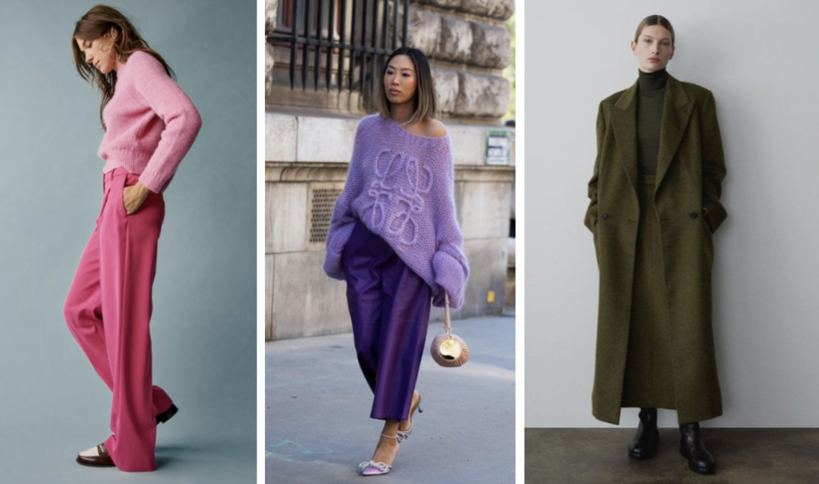
Monochromatic Color Scheme
A monochromatic color scheme involves using variations of a single color, such as different shades, tints and tones.
By sticking to one color and playing with its lightness and darkness, it creates a sophisticated and harmonious aesthetic.
This color scheme is popular in fashion and design for its simplicity and versatility.
Example: Shades of blue, this scheme uses variations of the same hue (blue) at different levels of saturation and brightness, creating a unified and elegant look.

Split-Complementary Color Scheme

This scheme is a variation of the complementary color scheme. Instead of using the exact complementary color, it involves selecting one color and the two colors adjacent to its complementary color on the color wheel.
It offers a balanced approached that retains the contrast of complementary colors while reducing the potential for overwhelming visual effects.
Example: Blue, yellow-orange, and red-orange, this scheme combines a base color (blue) with two colors adjacent to its complementary color (yellow-orange and red-orange), offering balance and contrast.
Triadic Color Scheme
It consists of three colors that are evenly spaced around the color wheel, forming an equilateral triangle.
Triadic color schemes offer a balanced and dynamic approach to color combinations, providing contrast while maintaining harmony.
Examples: Red, green, and blue, these colors are evenly spaced around the color wheel, creating a vibrant and balanced palette with primary colors.

Tetradic (double-complementary) Color Schemes
This schemes uses two complementary pairs, creating a more complex and dynamic combination.
This creates a more complex and dynamic combination of colors.
Example: Red-Green-Blue-Orange: In this scheme, red and green are complementary colors, and blue and orange are complementary colors. This combination creates a vibrant and balanced palette with warm and cool tones.
Warm and Cool Colors

Warm and cool colors are two broad categories of color distinguished by the feelings or associations they evoke and their position on the color wheel.
| Warm Colors | Cool Colors |
| Associated with warmth, energy and excitement | Associated with calmness, tranquility and serenity |
| Include reds, oranges, yellows and warm tones of browns and tans | Include shades such as blues, greens, purples and cool tones of grays and whites |
| Create a sense of intimacy and intensity | Create a sense of distance and spaciousness |
| In fashion, warms colors are often used to create bold and eye-catching looks. Red dresses, orange tops, yellow accessories can add vibrancy and energy to an outfit | In fashion, cool colors are often used to create soothing and elegant looks. Blue denim jeans, green dresses and purple scarves can add a sense of calm sophistication to an outfit |
| Popular in fall and autumn fashion trends, reflecting the colors of changing leaves and cozy aesthetics | Popular in spring and summer fashion trends, evoking images of clear skies, lush landscapes and refreshing breezes |
Colors allow us to make fashion choices based on our mood, the message we want to convey or again can be influenced by seasonal trends, style preference and occasion.
Warm colors are often chosen for outfits intended to make a bold statement or evoke feelings of passion and energy. They can be particularly flattering on individuals with warm skin undertones.
Cool colors, on the other hand, are selected to outfits aiming to create a sense of calmness, elegance or professionalism. They can complement individuals with cool skin undertones.

Color Psychology in Fashion

Color psychology in fashion explores the emotional and psychological effects that different colors have on individuals and how these effects influence fashion choices. It plays a significant role by influencing emotions, conveying messages, and shaping personal and brand identities. Fashion designers use the power of color to create impactful and visually compelling looks that resonate with their audience.
Each color carries its own set of associations and influences in fashion:
- Red: Symbolizes passion, energy, and confidence. It’s attention-grabbing and often chosen for formal events or evening wear to make a bold statement.
- Blue: Represents trust, reliability, and versatility. It’s commonly used in professional attire for its calming effect and suitability for both casual and formal wear.
- Yellow: Signifies happiness, warmth, and playfulness. Best used in moderation for daytime looks to add a pop of color and cheerfulness.
- Green: Evokes feelings of nature, growth, and tranquility. Ideal for casual and outdoor wear for its fresh and harmonious qualities.
- Purple: Associated with luxury, creativity, and elegance. Often seen in formalwear for its sophistication, and lighter shades can convey romance and whimsy.
- Orange: Represents enthusiasm, vitality, and spontaneity. Adds warmth and vibrancy to outfits, commonly used in activewear or to liven up neutral ensembles.
- Black: Symbolizes power, elegance, and timelessness. Universally flattering and suitable for any occasion, it adds sophistication and definition to outfits as a staple in fashion.
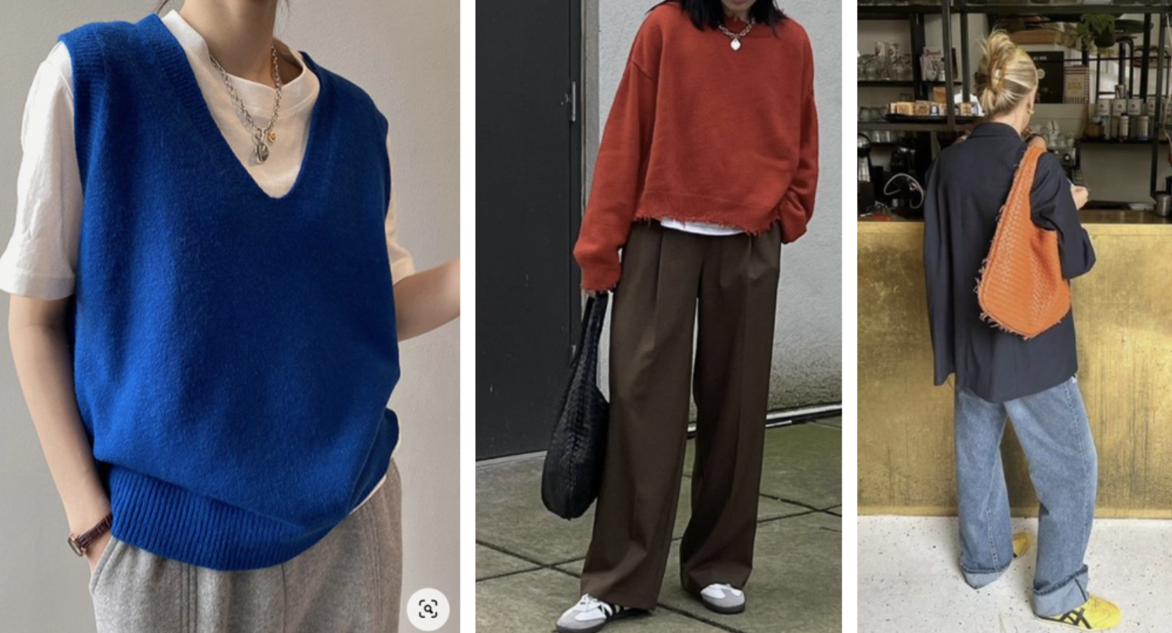
Color Theory as a Minimalist
As minimalist myself I always wonder how color theory can be valuable. We always tend to go for simpler look, with limited color palette and approaching the color theory as a minimalist is different as approaching like an extravagant.
Neutral Palette
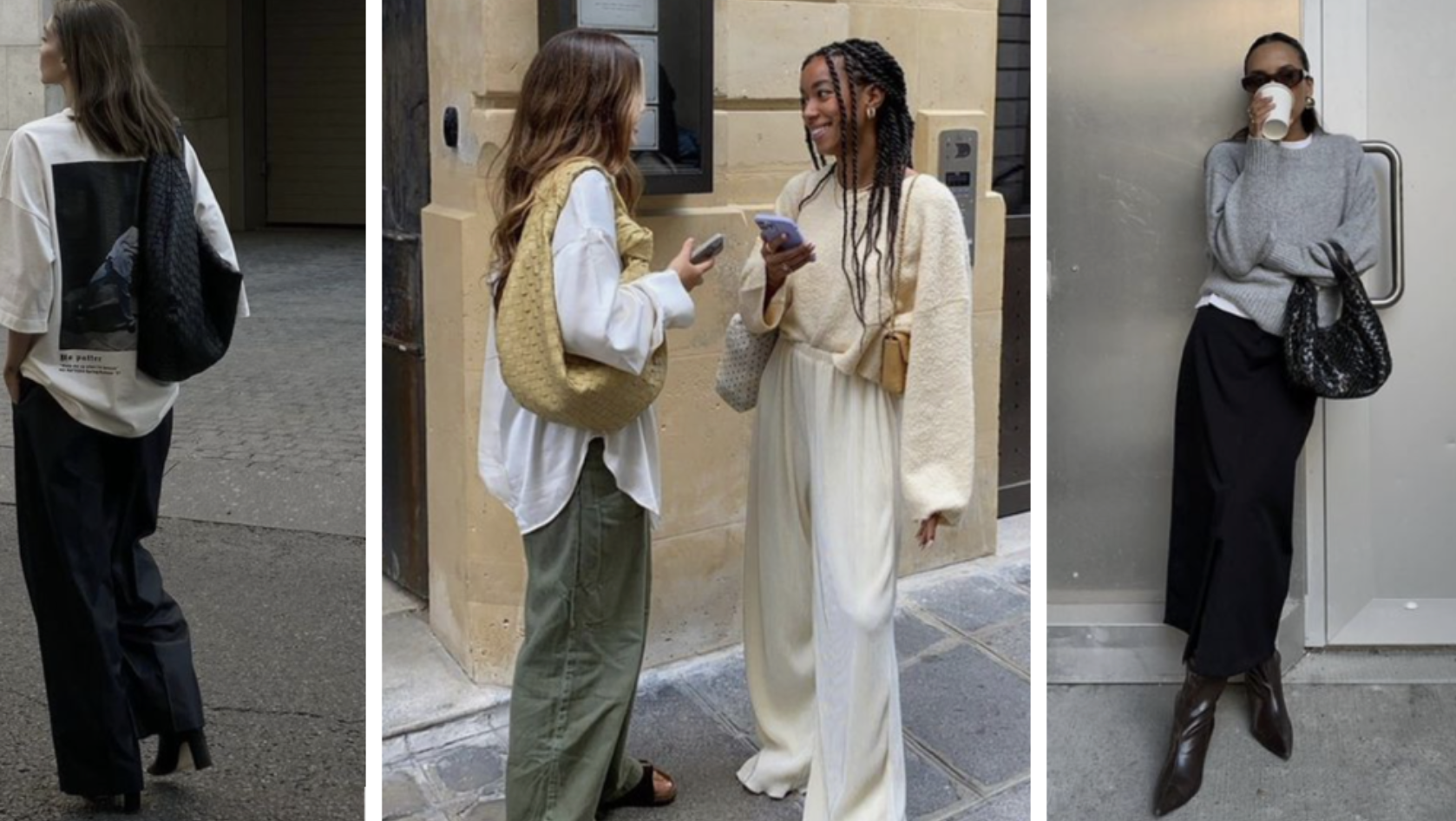
We tend to embrace neutral color more such as black, white, gray, beige and navy blue. Because they are versatile, timeless and easy to mix and match. It allows us to create cohesive and sophisticate looks with minimal effort.
Monochromatic Looks
Monochromatic looks create a sleek and streamlined aesthetic while adding depth and visual interest without introducing additional colors.
Accent Colors

In our outfit we introduce limited colors to complement the neutral palette of our outfit. This adds a pop of color to your outfits while maintaining a minimalist aesthetic.
Texture and Contrast

Incorporate texture and contrast into our minimalist outfits add visual interest without relying on wide range of colors. It’s good to experiment with different textures such as knitwear, denim, leather and silk to create dimension and depth within our minimalist wardrobe.
Most importantly, we have to follow also our personal style and choose colors and combinations that resonate with us, reflect our personality and the colors that make us feel confident and comfortable in our own skin.
Minimalist tend to opt for colors that promote calmness, clarity, and focus such as soft blues, muted greens, or earthy tones. Theses colors can create a serene and tranquil atmosphere in our wardrobe.
And as a true minimalist myself, as explained in my previous article that you can read here. We chose quality over quantity. Investing in high-quality and timeless pieces in my color palette. Choosing timeless silhouettes, classic designs, durable fabrics will remain relevant season after season.
Therefore, applying color theory principles with a minimalist mindset, we can curate a wardrobe that is both stylish and streamlined, allowing us to make intentional choices that align with our values and aesthetic preferences.
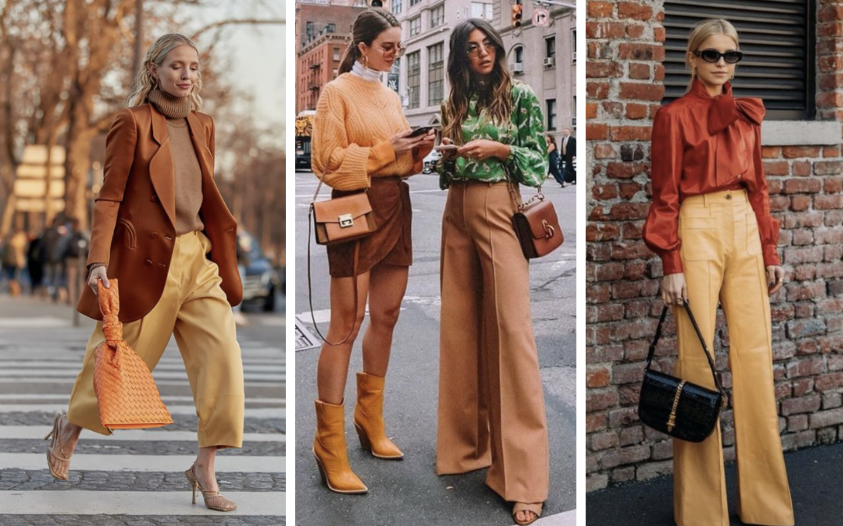
Tips to coordinate the colors of your outfit: The three-colors combo
In fashion, a three-color combination refers to an outfit or ensemble composed of three distinct colors. This combination of color can be used to create visual interest, balance and cohesion in an outfit.
I can give you some tips to combine three different colors, but in general chose two colors that works well together and add one more in the mix, generally a neutral color.
The basic guidelines that can be followed for this three-colors combo are:
- Main Color: Choose one primary color that will dominate the outfit. This color will typically be the most prominent and can be used for pieces like tops, bottoms, or outerwear.
- Secondary Color: Select a secondary color that complements your main color. This color can be used for accents or accessories to add depth and interest to the outfit. It could be a color from the same family as the main color or one that contrasts nicely with it.
- Accent Color: Finally, incorporate an accent color to provide pops of interest and contrast. This color should be used sparingly and can be featured in accessories like shoes, bags, jewelry or a scarf. It adds visual intrigue to the outfit without overpowering the main colors.
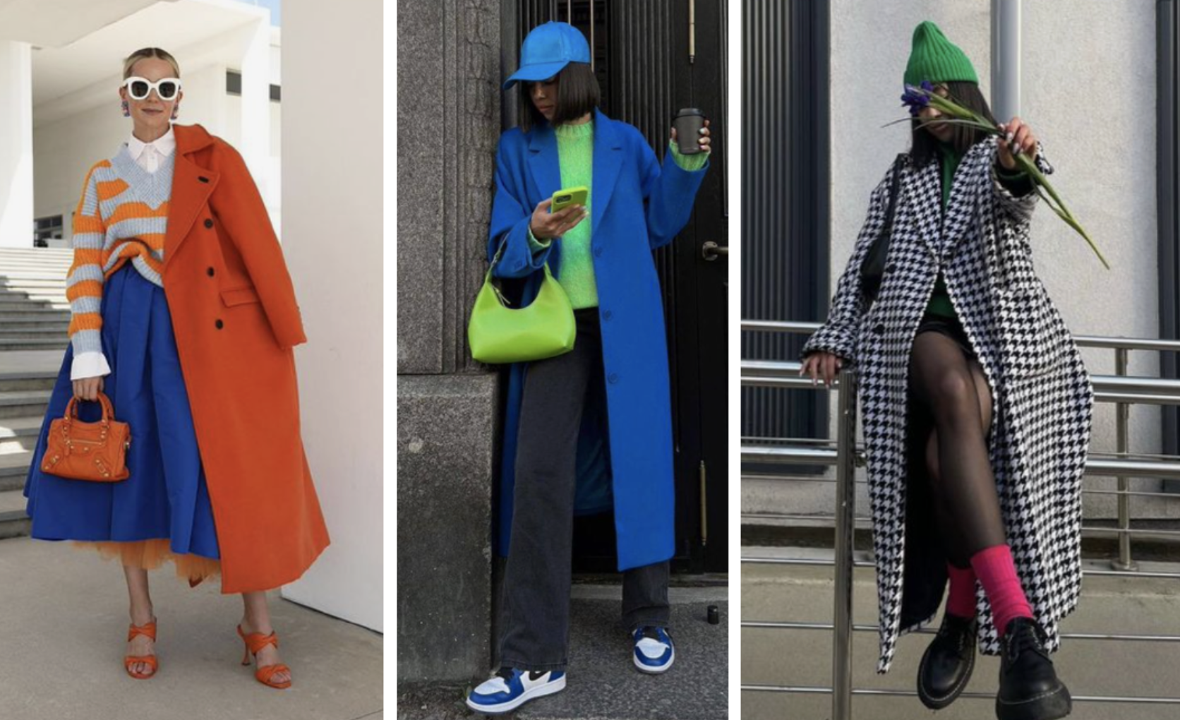
Whether is the whole outfit in three different colors or with the accessories, the key here is to experiment with different color combinations to find what works best for your personal style and preferences. Don’t be afraid to mix and match colors to create unique and eye-catching outfits!
In summary, color theory in fashion serves as a powerful tool for creating cohesive and visually appealing outfits. Understanding the basics of color theory and color psychology allows individuals to express their personality and mood through clothing choices.
For a minimalist, like myself, color theory provides guidance on curating a simplified wardrobe with a limited color palette, while the three-color combination rule provides practical tips for effectively incorporating colors into outfits.
Mastering color theory empowers individuals to make intentional and harmonious color choices, enhancing their fashion experience and self-expression.
And you, do you have any favorite color combinations or tips for coordinating outfit colors effectively? For my fellow minimalist out there, what challenges do you face when building a wardrobe with a limited color palette? Or for my dear extravagant friends (which I envy), what are your challenges building a wardrobe with bold colors?
Let me know is the comments below, and follow me for more article on fashion!
Don’t forget to like and share this article if you found it useful!
See you soon, Beautifully Moi!

[…] English version here […]
LikeLike